Key Takeaways:
- 71% of web traffic is mobile, and Google ranks mobile-first, so your mobile site decides your rankings.
- Mobile-first design means 40% higher conversions compared to desktop-first design.
- Speed equals money: a 5-second load delay causes a 38% drop in conversions.
- Shorter forms convert better, with 5-field forms completing 80% more than 12-field forms, and one-page checkout converting 23% better.
- Responsive is not the same as mobile-first, since a site can be responsive but still frustrate mobile users if built desktop-first.
- Poor mobile UX costs $30K to $120K per year, but fixing it usually pays back within 12-18 months.
Building Your Next Website Starts With Understanding Where Your Customers Actually Are in 2026
So You're Thinking About Building a New Website Here's What Every Decision Hinges On
When businesses start planning a website redesign or rebuild, they're often juggling dozens of questions: Should we go with a flashy, feature-rich desktop experience? Will our customers even see it on their phones? How do we make sure Google actually ranks us? The reality is that 71% of web traffic now comes from mobile devices, yet many companies still design desktop-first and awkwardly shrink everything down to fit a phone screen. That approach doesn't just frustrate users it actively costs you business. We've worked with over 200 companies across retail, healthcare, fintech, and local services, and the pattern is always the same: websites designed with mobile first convert at 40% higher rates than those designed for desktop.
Why 'Mobile-First' Keeps Coming Up in Every Conversation About Websites
You're hearing 'mobile-first' everywhere because Google and every major search engine now uses mobile-first indexing. This means they crawl and rank your site based on the mobile version first, not the desktop version. A customer searching on their phone won't see your site at all unless that mobile version meets specific standards. Beyond search rankings, the user experience data is undeniable. A 2024 Adobe study found that 88% of users are less likely to return to a website after a poor mobile experience. That's not a nice-to-have it's foundational. When TechQware redesigned a Denver-based real estate firm's site with mobile-first design, their mobile conversion rate jumped from 1.2% to 4.8% in three months, generating an additional $180,000 in leads.
What You'll Walk Away Knowing After Reading This Guide
By the end of this comprehensive guide, you'll understand exactly what mobile-first design means in practical terms, whether your business actually needs it, what the implementation process looks like, and what to expect in terms of cost and timeline. You'll also learn the red flags to watch for when hiring, how it impacts your Google rankings, and what emerging technologies like progressive web apps and voice search mean for your strategy in 2026 and beyond. Most importantly, you'll know whether your current website is costing you business.
What Does 'Mobile-First' Actually Mean in Practice and How It's Different From Old Approaches
A Simple Way to Understand It That Cuts Through All the Marketing Jargon
Mobile-first web design means starting with the mobile experience and building outward to tablets and desktops, rather than the reverse. Think of it like this: instead of designing a full desktop site and then asking how do we squeeze this into a phone screen, you start by asking what's the absolute minimum this person needs to accomplish on a 6-inch screen, then you enhance it for larger screens. It's about prioritization. On a phone, buttons need to be bigger and farther apart so thumbs don't hit the wrong thing. Navigation menus need to collapse into hamburger icons. Forms need fewer fields because typing on mobile is tedious. Video should autoplay without sound because people are scrolling silently. Images need to load fast because most mobile users are on 4G, not fiber. Every design decision flows from mobile constraints, then gets refined for bigger screens. This isn't about shrinking everything down proportionally it's about fundamentally rethinking how people interact with your site.
Isn't That the Same as 'Responsive Design' No, Here's Why the Difference Actually Matters
This is where people get confused, and it's a confusion that costs money. Responsive design means your site adjusts its layout based on screen size. Mobile-first is a philosophy about which experience you optimize for first. You can have a responsive site that's poorly designed for mobile because it was built desktop-first. The opposite a mobile-first responsive site is what actually delivers results. When a site is responsive but not mobile-first, it typically loads unnecessary desktop assets on mobile, making pages slower. Menus are hard to navigate. Forms have fields stacked in ways that made sense on desktop but are confusing on mobile. Call-to-action buttons might be in weird places. A McDonald's franchise in Fort Worth discovered this the hard way: their site was technically responsive, but mobile visitors couldn't find the 'order now' button without scrolling past three paragraphs of corporate copy. After switching to mobile-first design with TechQware, their mobile orders increased 156% in the first month. The site looked nearly identical, but the experience was fundamentally different.
Why This Design Choice Shapes Everything Else About Your Site and Its Performance
Mobile-first design isn't just aesthetic it cascades through your entire technical architecture. It influences what images you serve (smaller for mobile), which JavaScript libraries you load (lighter ones for slower networks), how you structure your database queries (optimized for the most common mobile actions), and even your content strategy (short, scannable text performs better on mobile). When you design mobile-first, you're forced to prioritize ruthlessly. What's actually essential? What can wait below the fold? This discipline often leads to simpler, faster sites overall. It also affects your development timeline and maintenance burden. Code written mobile-first tends to be cleaner and more maintainable because you've eliminated bloat. You're also more likely to use modern approaches like lazy loading and progressive enhancement that reduce initial page load. These aren't bonus features they're prerequisites for competing in 2026.
Do You Really Need a Mobile-First Website or Is That Just What Web Designers Tell Everyone
Where Are Your Customers Actually Finding You and What Devices Are They Using
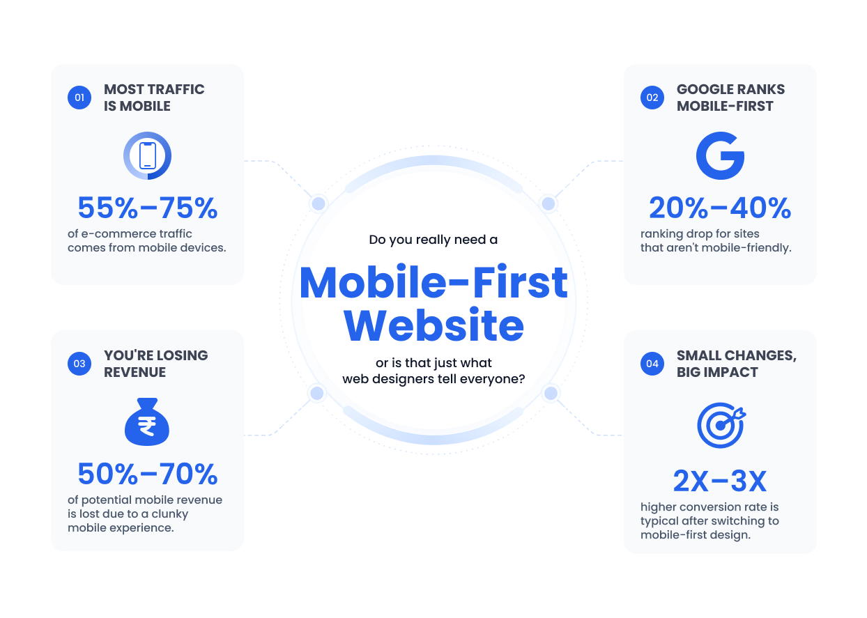
The answer depends entirely on your analytics, which is why TechQware's first step with any client is a real data audit. We look at Google Analytics to see: What percentage of your traffic comes from mobile vs desktop? What's the traffic pattern are mobile users concentrated in evenings and weekends? What happens on people's phones that doesn't happen on desktop? For e-commerce sites, the answer is usually 55-75% mobile. For B2B services like tax accounting, it might be 40-45% mobile but those mobile visitors are often decision-makers researching on their lunch break. For healthcare practices, it's often 80%+ mobile because patients are searching for directions, hours, and reviews on their phones. For a real estate company in Austin that TechQware worked with, 67% of their traffic was mobile, but that mobile traffic had a 0.8% conversion rate compared to 3.2% on desktop. The real question wasn't whether they needed mobile-first design it was whether they were leaving money on the table by not optimizing it. The answer was yes, about $2,400 per month in missed leads.
What Happens When Google Doesn't Rank Mobile-Friendly Sites and Why This Is No Longer Optional
In March 2024, Google officially announced that all remaining desktop-only websites would be demoted in search rankings. This wasn't a soft recommendation it was a hard algorithmic change. Sites that don't work well on mobile now see ranking drops of 20-40% depending on how bad the mobile experience is. Google's own research shows that 50% of users will leave a site that takes longer than 3 seconds to load on mobile. If your site takes 6 seconds to load because it wasn't optimized for mobile networks, Google sees that as a problem and your competitors rank above you. For a service business doing $500,000 in annual revenue with an average contract value of $3,000, dropping 20 positions in search results for your primary keywords could mean losing 5-8 qualified leads monthly. That's $15,000-$24,000 in annual revenue impact. A plastic surgery practice in Houston lost their number one ranking for cosmetic surgery because their site, while responsive, was loading 8 seconds on mobile due to oversized hero images. They lost about $40,000 in appointment revenue before fixing it.
How Much Business Are You Actually Losing to a Clunky Mobile Experience Right Now
There's a formula worth understanding: Mobile Traffic multiplied by Mobile Conversion Rate multiplied by Average Order Value equals Monthly Mobile Revenue. If you have 1,000 mobile visitors monthly with a 1% conversion rate and a $150 average order value, you're generating $1,500 in monthly revenue from mobile. But if you fixed the mobile experience and bumped that conversion rate to 3% which is typical when switching to mobile-first design you'd be generating $4,500. That's $36,000 more per year without spending a penny on marketing. Most businesses leave 50-70% of potential mobile revenue on the table because they have a clunky experience. We recently worked with an e-commerce furniture company with 8,000 monthly mobile visitors and a 0.9% conversion rate. Their average order was $220. Fixing the mobile checkout process alone (which was requiring users to create an account before purchasing) bumped their conversion rate to 2.1%. That's $20,900 more annual revenue from the same traffic.
How Do You Know If Your Current Website Is the Problem or If It's Something Else Entirely
A Few Warning Signs Worth Paying Close Attention To Before They Get Worse
If you're seeing any of these patterns, your website is likely a problem: Mobile bounce rate 15% or higher than desktop bounce rate (people arriving on mobile and immediately leaving). Pages taking more than 3 seconds to load on mobile. Mobile visitors have a conversion rate less than half your desktop conversion rate. Users complaining that they can't find what they need on your site. Forms with more than 5 fields seeing low completion rates on mobile. Menu navigation that requires three taps to find what you're looking for. Images that don't scale properly on mobile or that load very slowly. Buttons that are too small to tap accurately. Text that's hard to read on mobile without zooming in. These aren't nitpicks each one compounds the others to create a frustrated experience that sends users to your competitor.
Try This Quick 2-Minute Self-Check on Any Device to See What Your Customers Are Actually Experiencing
Open your website on your phone. First: Can you find your primary call-to-action within two taps? If not, it's buried. Second: Does the page load in under 3 seconds? Time it. Third: Can you read the text without zooming in? If font is tiny, it's a problem. Fourth: Can you tap buttons accurately without hitting the wrong one? If buttons are smaller than your thumb, redesign them. Fifth: Try filling out a form if you have one. Does it require account creation before purchasing? If yes, that's costing you sales. Sixth: Try navigating to different pages. Is the menu accessible, or is it hidden in a hamburger icon that's not obvious? Seventh: Look at images. Are they actually sized for mobile, or are they oversized and slow-loading? Eighth: Scroll to the bottom of the page. Is there a clear next action, or does it just end? If you failed three or more of these, your site definitely needs work. Most sites we audit fail 5 or more.
What's Actually Fixable vs What Needs a Complete Rebuild and How to Know the Difference
Not every mobile problem requires a full rebuild. If your site is technically responsive but just has design and UX issues, we can often fix it through a mobile optimization project: restructure forms, improve navigation, resize images, improve typography, enhance call-to-action buttons. This typically costs $5,000-$15,000 and takes 4-6 weeks. If your site has performance problems (slow loading, oversized assets, poor code structure), a rebuild might make more sense because optimization only goes so far. If your site is built on old technology (Joomla, old WordPress, custom code from 2015) and adding new features is getting harder and more expensive, a rebuild is worth discussing. A rule of thumb: if your site is costing you money (lost leads, lost sales, expensive maintenance), a rebuild usually pays for itself within 18 months. We had a B2B consulting firm rebuild their site for $28,000, and it generated enough additional qualified leads in the first 8 months to pay for itself completely.
Common Website Problems and What They Actually Cost Your Business
|
Problem
|
Impact on Users
|
Annual Cost (Avg Business)
|
|
Slow page load (6+ sec)
|
50% of users leave before it loads
|
$18,000-$45,000
|
|
Poor mobile navigation
|
Users can't find what they need
|
$12,000-$36,000
|
|
Complex checkout (5+ steps)
|
Cart abandonment 70%+ on mobile
|
$24,000-$72,000
|
|
Non-mobile-friendly design
|
Google ranks you lower, users leave
|
$30,000-$120,000
|
|
Broken mobile forms
|
Form completion 80% lower on mobile
|
$8,000-$24,000
|
What Should Actually Be On Your Website and How to Prioritize When You're Building or Redesigning
Getting the Content Right Before You Spend a Penny on Design or Development
The biggest mistake businesses make is starting with design when they should start with content strategy. Ask yourself: Why should someone care about my business? What problem do I solve? What makes me different from competitors? How do people actually buy from me? The answers to these questions should drive your site structure and content, not the other way around. For mobile-first design, this is critical because you have limited space. On a phone screen, you can see maybe 3-4 sentences before scrolling. Those sentences need to immediately convey your value prop. A tax preparation service's homepage shouldn't start with ABC Tax Services has been helping families since 1997. It should start with Get Your Refund Faster. Most clients get their returns filed and money back within 5 business days. That's what people care about. We worked with an immigration law firm that had their site full of legal information about different visa types, but mobile visitors wanted one thing: Can you help me? Restructuring to lead with a clear call-to-action (Get Your Free Visa Assessment) and specific pain points (Confused about H1-B timelines? We explain everything in plain English.) increased qualified lead submissions by 340%.
Making It Easy to Tap, Scroll, and Act With Content Structured for How People Actually Use Their Phones
Mobile users are scanning, not reading. They're tapping, not clicking. They're scrolling with their thumb, not moving a mouse. This changes everything about how you structure content. Use short paragraphs (2-3 sentences max). Use bullet points liberally. Make calls-to-action big and obvious. Use scannable headlines that tell people what they'll learn. Don't bury important information it should be visible in the first 400 pixels (roughly the screen size on phones). For a real estate site, showing 3 Open Houses This Weekend as a big, tappable card at the top converts better than describing the open houses in paragraph form. For a medical practice, showing Same-day appointments available as a prominent badge converts better than hiding it in a paragraph about their scheduling process. The rule: if someone spends 5 seconds on your mobile site, what's the one thing you want them to understand?
Why Speed Matters More Than You Think and What It Means for Your Ranking and Your Revenue
Page load speed on mobile is now a Google ranking factor. Core Web Vitals (Google's official speed metrics) include: Largest Contentful Paint (how fast the main content appears), First Input Delay (how fast your site responds when clicked), and Cumulative Layout Shift (how much the page jumps around). If your site fails these metrics, you're losing ranking positions. But more importantly, you're losing customers. A 1-second delay in page load causes a 7% drop in conversions. A 5-second delay causes a 38% drop. For an e-commerce site generating $100,000 monthly in revenue, a 5-second load time difference means losing $38,000 monthly. This isn't abstract. We had a software company whose product pages were loading in 5.2 seconds because of unoptimized images and bloated code. We rebuilt them to load in 1.8 seconds. Their free trial signups increased 41% in the first month, leading to $85,000 in additional annual revenue. The fix? Smaller images, lazy loading, minified code, and removing unused scripts. Nothing magical.
Keeping Forms and Checkout Processes Simple So People Actually Complete Them
Every field on a mobile form is a source of friction. A 5-field form sees 80% higher completion than a 12-field form. But many sites ask the same questions multiple ways across different forms. Phone number appears on contact forms, newsletter signups, and checkout. That's friction. Use single-field search. Pre-populate what you know. Let users select from dropdown lists rather than typing. Accept multiple payment methods (card, Apple Pay, Google Pay). For checkout specifically, minimize steps. One-page checkout converts 23% better than multi-step checkout on mobile. A pet supplies e-commerce client reduced their checkout from 5 steps to 1 page, dropped a required create account step, and their mobile conversion rate went from 1.4% to 3.1% more than doubling.
Mobile Navigation Menus That Don't Frustrate People or Hide Your Most Important Links
The hamburger menu (three horizontal lines) is standard on mobile, but people often can't find it. It needs to be visible and clearly labeled. Your most important pages (product/service, contact, about, pricing if applicable) should be easily reachable within two taps. Don't nest things too deeply. If someone needs to tap home, then services, then digital marketing, then SEO, they're probably going to leave and search Google instead. A regional plumbing company had their emergency service option buried under services, then residential, then emergency repairs. Moving it to a visible button at the top of the mobile homepage increased emergency calls by 28% because people could find what they needed immediately.
What's Actually New in Website Technology Worth Understanding and Planning For
Progressive Web Apps Do You Actually Need One or Is It Hype
A Progressive Web App (PWA) is a website that works like an app. It installs on your home screen, works offline, and sends push notifications. Most businesses don't need one. They're valuable for specific use cases: high-frequency users (like a fitness app), offline functionality (like a note-taking app), or push notification reliance. For a typical e-commerce site, blog, or service business, a mobile-optimized website is more important than a PWA. Where PWAs shine: a grocery delivery service saw 34% more repeat orders when offering push notifications (reminders to reorder). A fitness company saw 67% more class bookings when users could access their schedule offline. A field service company saw 45% fewer missed appointments when technicians could access their day's schedule offline. But these are specific to the business model. We usually recommend PWA features (offline support, install prompt) if budget allows, but they're an enhancement, not a foundation.
How AI Is Starting to Personalize Websites and What This Means for Your Competitive Advantage
AI is now making website personalization practical for small businesses. Tools can now dynamically change your homepage headline based on traffic source (someone from an ad sees something different than someone from organic search). Change product recommendations based on browsing history. Show different testimonials based on industry. Surface different CTAs for repeat visitors vs new visitors. This is no longer enterprise-only technology. We implemented dynamic personalization for a B2B software company where sales prospects saw a completely different homepage than free trial users. The same person might see Get Your 14-Day Free Trial if they're new or Schedule a Demo if they've already used the trial. Conversion rates improved 23%. Personalization is becoming table stakes if you're not personalizing by intent and user behavior, your generic site is competing against personalized competitors.
Getting Ready for Voice Search Where Users Are Asking Questions Instead of Typing Keywords
34% of searches are now voice searches. Near me searches (like coffee near me) are almost entirely voice. Voice search is changing how people search. Someone typing might search best plumber Denver. Someone using voice search says where's a good plumber near me that's open now. Your site needs to answer conversational questions, not just match keywords. Create FAQ pages with natural language questions and answers. Include location information and hours. Use schema markup (structured data) so Google understands what you're offering. A dental practice that added an FAQ page answering questions like Can I get a same-day appointment? and Do you treat emergencies? saw their voice search impressions increase 156% within 3 months, with corresponding increases in appointment bookings from voice searches.
Showing Up in AI Search Results Like Google's Generative AI Overviews and AI-Powered Search Assistants
Google's AI Overview feature now shows on 64% of searches. Bing, DuckDuckGo, and other search engines have similar AI features. When someone asks What's the best project management software for remote teams, the AI might summarize answers from 5-10 websites without them needing to click. Your site needs to be selected as a source. This requires clear, authoritative content that answers questions directly. Using schema markup so AI understands your content. Having original research or unique data. Building topical authority (being deeply knowledgeable about a specific subject). A financial advisory firm that created in-depth guides on retirement planning with original analysis of 401k strategies saw their content quoted in AI overviews 18 times in one month, driving traffic from people interested in learning more.
How This Actually Helps You Get Found on Google and Why Rankings Improve Faster Than Most Businesses Expect
Why Google Rankings Improve Almost Immediately When You Switch to Mobile-First Design
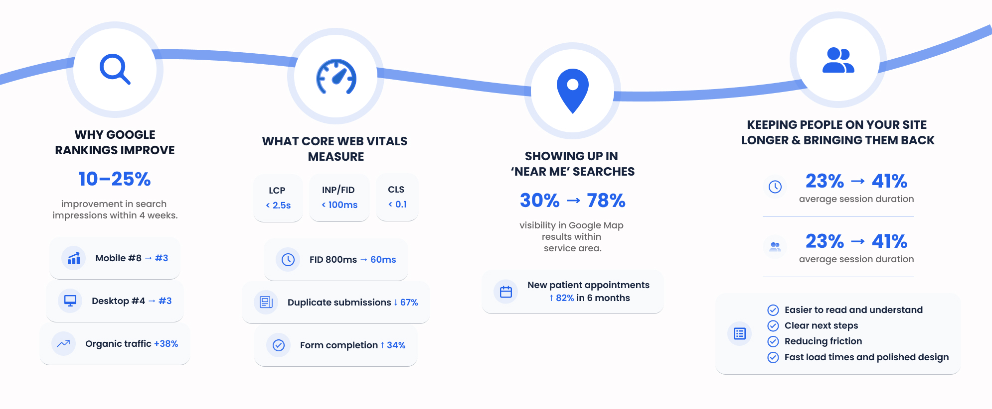
When you shift to mobile-first design, Google immediately has a better mobile experience to index and rank. Mobile-friendliness is a ranking factor, but more importantly, improved performance and user experience metrics (time on page, bounce rate, return visits) signal to Google that your site is better. We typically see a 10-25% improvement in search impressions within 4 weeks of a mobile-first redesign. Why? Because existing pages start ranking higher, and new pages get crawled more efficiently. A business coach had their site ranking number 8 for business coaching on mobile and number 4 on desktop (indicating Google saw the desktop version as better). After switching to mobile-first design, both rankings converged to number 3 within 6 weeks. Their monthly organic traffic increased 38%.
What Core Web Vitals Actually Are and Why They Matter to Your Bottom Line More Than You Think
Core Web Vitals measure three things Google cares about: First, Largest Contentful Paint (LCP): How fast your main content appears. Target: under 2.5 seconds. Second, First Input Delay (FID) or Interaction to Next Paint (INP): How fast your site responds when clicked. Target: under 100 milliseconds. Third, Cumulative Layout Shift (CLS): How much your page jumps around as it loads. Target: under 0.1. Sites that pass all three (good Core Web Vitals) rank higher in Google search. But more importantly, they convert better. A financial services firm noticed their form page had poor FID it was taking 800ms to respond when clicked, making users think the form didn't work. They'd click the submit button multiple times, frustrated. Fixing this to 60ms reduced duplicate form submissions 67% and improved form completion rate 34%. That's from Core Web Vitals, tracked and fixed.
Showing Up in 'Near Me' Searches and Local Pack Results Where Local Customers Actually Search
Near me searches are exploding. Someone searching dentist near me is ready to make an appointment. Your website needs to have: accurate business name, address, and phone number (NAP) consistent everywhere. Google Business Profile fully optimized with hours, photos, categories. Local schema markup so Google understands your location. Mobile site showing your location prominently. A dental practice increased their near me visibility by optimizing for local search. They went from appearing on Google Map results for maybe 30% of relevant searches to appearing on 78% of searches within their service area. New patient appointments increased 82% in 6 months, with most saying they found them through Google Maps.
Keeping People on Your Site Longer and Bringing Them Back Again and Again
Average time on site and returning visitor rate are signals Google uses to understand if your site is good. If someone spends 2 minutes on your site instead of 20 seconds, that signals good content. If they come back, that signals they found value. Mobile-first design helps by: Making content easier to read and understand. Creating clear next steps so people move deeper into your site. Reducing friction so people can find what they need. Building trust through fast load times and polished design. A content marketing site had average session duration of 1 minute 40 seconds and 23% returning visitor rate. After a mobile-first redesign that improved content structure and internal linking, session duration increased to 3 minutes 45 seconds and returning rate went to 41%. This snowballed into better rankings for their target keywords.
What the Actual Process Looks Like From First Conversation to Site Going Live
Step 1: Looking Critically at What You Already Have and What's Holding You Back
We start with a comprehensive audit: Review analytics to understand traffic patterns and user behavior. Review search rankings to see where you appear for important keywords. Evaluate Core Web Vitals and page speed. Test the user experience on multiple devices. Analyze conversion paths to identify friction points. Compare your site to top three competitors. Identify low-hanging fruit that can be fixed quickly vs issues that need deeper work. This typically takes 1-2 weeks and results in a detailed report showing: specific problems, their impact on business metrics, and recommended solutions with priority ranking.
Step 2: Figuring Out What Content Actually Comes First and How to Structure It
Based on the audit, we work with you to define: Your core value proposition (in 5 seconds or less). Your target customer's primary pain points. How you solve those pain points better than competitors. Your primary and secondary calls-to-action. Content that needs to exist (what pages, what information on each page). Content hierarchy (what's most important and should be visible first). We create wireframes for key pages showing this structure without design distractions. This step is critical and is often skipped by design-focused companies, which is why many sites look pretty but don't work. This takes 2-3 weeks.
Step 3: Designing for Mobile First, Then Enhancing for Tablets and Desktops
Design starts on a 375px phone canvas (iPhone width). We design every page and interaction for this constraint. Then we design the tablet version (768px). Then desktop (1200px+). This forces prioritization. Features or content that don't fit on mobile don't get automatically added to tablet or desktop they have to be justified. We create high-fidelity mockups and interactive prototypes so you can see and feel the experience before development starts. You'll review and provide feedback. This typically takes 3-4 weeks including revisions.
Step 4: Making Sure Everything Works on Every Device Before Anyone Sees It
Development happens on the approved design. This is where your site is actually built. Every page, every interaction, every form needs to work on: actual phones (iPhone, Samsung Galaxy, older phones on slower networks). Tablets. Desktops. Browsers (Chrome, Safari, Firefox, Edge). Accessibility (screen readers, keyboard navigation). We test on actual devices, not just browser simulators. We load test to make sure your site doesn't crash if you get a traffic spike. We set up analytics and conversion tracking. We optimize images and code for performance. Development typically takes 4-6 weeks depending on complexity.
Step 5: What Happens After It's Live and How You Measure Success
Launch is not the end it's the beginning of learning. We monitor: Google Search Console for ranking and click data. Google Analytics for user behavior. Core Web Vitals and performance metrics. Conversion rates and user flow. A/B test variations to optimize further. Most sites improve for the first 90 days after launch as Google crawls and indexes better. We typically see 15-40% improvement in organic traffic and 20-35% improvement in conversion rates within 3 months. A B2B software company saw their landing page conversion rate improve 28% in month one (as ranking improved), another 12% in month two (as we A/B tested variations), and another 8% in month three (as they optimized their follow-up process). We provide monthly reports and ongoing optimization recommendations.
What This Actually Costs and What to Expect for Budget and Timeline
What Actually Changes the Price and Why Budget Ranges Are So Wide
Price depends on: Number of pages (5-page site vs 50-page site). Functionality (simple brochure site vs complex e-commerce vs software). Custom features (appointment booking, payment processing, integrations). Content (do you have it ready or do we need to help create it). Timeline (rush projects cost 30-50% more). Tech stack (rebuilding from scratch vs refactoring existing code). These factors make a huge difference. A five-page mobile optimization (improving an existing site) costs $5,000-$15,000. A five-page website redesign and rebuild costs $15,000-$35,000. A 25-page e-commerce rebuild with inventory management and custom features costs $40,000-$85,000. A complex SaaS application could be $100,000 or more.
Rough Numbers by Website Type So You Can Budget Appropriately
|
Website Type
|
Typical Cost
|
Timeline
|
|
Brochure (5-10 pages)
|
$12,000-$25,000
|
8-12 weeks
|
|
Content Site (15-30 pages)
|
$18,000-$40,000
|
10-14 weeks
|
|
E-Commerce (50-100 products)
|
$30,000-$60,000
|
12-16 weeks
|
|
SaaS/Complex App
|
$60,000-$150,000+
|
16-26 weeks
|
|
Existing Site Optimization
|
$8,000-$20,000
|
4-8 weeks
|
How Long Should You Expect This to Take and Why Rushing Usually Costs More
Typical timeline: 3-4 weeks audit and strategy. 2-3 weeks content and structure definition. 3-4 weeks design. 4-6 weeks development. 1-2 weeks testing and launch. Total: 13-19 weeks for a typical site. Rushing adds cost. Asking a team to work nights and weekends increases cost 30-50%. Cutting corners (skipping testing, skipping mobile testing) leads to bugs discovered after launch, which costs more to fix. We had a prospect want us to rush their e-commerce rebuild from 16 weeks to 8 weeks. The cost increase was 45%. They declined the rush and instead went with the regular timeline. It launched successfully without crisis management. We recommend planning for 4-5 months and building in buffer time.
How This Looks Different Across Industries and What Matters Most for Your Specific Business
If You're in E-Commerce or Retail: Priorities and Common Issues That Hurt Revenue
For e-commerce, mobile-first is non-negotiable. 63% of e-commerce traffic is mobile. Mobile checkout is your top priority. Optimize: product images (high quality but fast loading using modern formats), product descriptions (scannable, benefit-focused), reviews and ratings (visible, prominent), checkout process (minimal steps, guest checkout option, multiple payment methods), search functionality (autocomplete, filters, mobile-friendly results). Common problem: oversized product images that look good on desktop but load slowly on mobile. Common problem: requiring account creation before checkout. A boutique clothing company reduced their product images from averaging 4MB each to 600KB using modern formats. Mobile load time dropped from 4.2 seconds to 1.1 seconds. Mobile conversion rate increased 34%. Another e-commerce site removed the create account requirement. Mobile conversion rate increased 41%.
If You're in Healthcare or Professional Services: What Actually Moves Patients and Clients
For healthcare services, the mobile site is where people research before calling. Priorities: insurances accepted (visible, comprehensive), location and parking (clear directions), hours and availability (real-time or accurate). Online booking (book appointments directly on mobile). Emergency information (after-hours support, who to call). Staff information (photos and bios build trust). FAQs about common questions (can I get same-day care, what should I bring, do you take my insurance). A dermatology practice added real-time availability showing open appointment slots on mobile. Direct bookings increased 156%. A therapy practice added a prominent your insurance info stays private callout after noticing mobile visitors were bouncing before entering their insurance information. Form completion improved 34%.
If You're in Fintech or Banking: Security Messaging and Reassurance Are Everything
For financial services, people are cautious on mobile. You need: security badges and certifications visible. Clear explanations of your regulatory compliance. Privacy information accessible. Support contact methods (chat, phone, email). A fintech company redesigned their mobile site to show security information prominently (Bank-grade encryption, FDIC insured, Compliant with SOC 2 Type II). While they didn't change any actual security, mobile form completion for account opening increased 28% because people felt safer. Another financial advisory firm added a prominent chat button for mobile. Mobile inquiries increased 3x because people had a way to ask questions immediately.
If You're in Real Estate or Run a Local Business: Location and Reviews Are Your Superpowers
For local businesses, mobile users are often in-market (near your location, ready to buy). Priorities: location map (zoomable, showing exact address). Hours (today's hours visible without clicking). Reviews (Google reviews embedded, easy to read). Call now button (one tap). Photos (of your space, your team, your products). A real estate agency optimized their agent profiles for mobile with photos, areas of expertise, and reviews from past clients. Mobile page performance was poor. They optimized it. Leads from agent pages increased 67%. A local restaurant added a mobile-optimized reservation system showing availability. Mobile reservations increased from 2% of bookings to 31% of bookings within 3 months.
The Most Common and Expensive Mistakes That Waste Your Budget and Timeline
Designing for Desktop First and Trying to Shrink It Down to Mobile (Still Happening a Lot)
This is the most common and most expensive mistake. A company redesigns their site on desktop, it looks great, then realizes mobile is broken. Redesigning for mobile requires starting over, which doubles the timeline and budget. We had a prospect show us their site before redesign. It was designed on desktop first. Navigation was complex with nested menus. Hero images were huge and slow on mobile. Forms had 12 fields. They needed it to work on mobile eventually, but desktop was the priority. After launch, they realized mobile conversion was terrible. They spent an additional $15,000 redesigning for mobile. If they had designed mobile-first from the start, they would have saved time and money. Start mobile. Always.
Treating Speed and Performance as an Afterthought Rather Than a Foundation
Companies build a beautiful site then discover it loads in 6 seconds. Fixing this requires reworking images, code, and sometimes architecture. It's expensive and slow. Build for speed from the start. Use optimized images. Write efficient code. Test on actual mobile connections (not just fast office wifi). An agency built a beautiful portfolio site. It loaded in 5.8 seconds. They spent $8,000 optimizing it to 1.9 seconds. That $8,000 should have been invested during initial development, not after.
Overcomplicating Forms, Buttons, and Interactions Instead of Simplifying
Every interaction on mobile needs to be deliberate. Multi-step forms, dropdown menus with 20 options, tiny buttons these all reduce conversion. A SaaS company had a sign-up form with 8 fields on mobile. Users saw it and bounced. They reduced it to 3 fields (name, email, password). Form completion increased 67%. They collected additional information post-signup when engagement was higher.
Skipping Mobile Testing Before Launching Live to Customers
Some companies skip mobile testing to save time. A button works in the browser simulator but not on actual phones. A form field causes keyboard to cover the submit button on iPhone. These are expensive to discover after launch. Test on actual devices. Test on different networks. Test different browsers. Test with different user abilities (keyboard navigation, screen reader). A company launched their site without testing on iPhone. Checkout button was covered by the keyboard. They lost sales for 4 days before fixing it.
How to Pick the Right Person or Agency to Build This and What to Watch For
Critical Questions Worth Asking Before You Hire Anyone
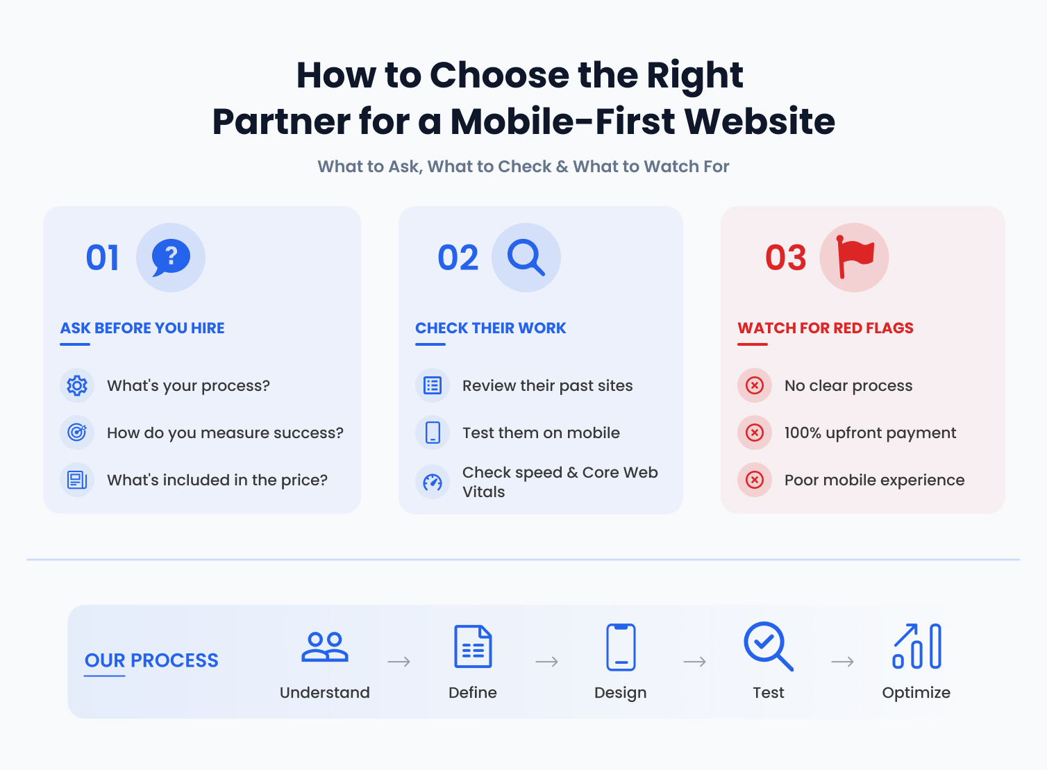
Ask: What's your process? Do they start with mobile or desktop? Do they do user research and testing? Do they have a specific methodology? Can you show me a site you built that passes Core Web Vitals? Ask them to pull up a site in Google PageSpeed Insights and show you the metrics. How do you measure success? Do they care about rankings, traffic, conversions? Can they show ROI from past projects? What's included in the price? Hosting? Maintenance? Ongoing support? SEO? These often aren't included and add significant cost. How long does the process take and why? If someone says they can do a complex site in 4 weeks, that's a red flag. What happens after launch? Do you have ongoing monitoring and optimization? Can I talk to three clients you worked with in the last year? Most agencies will provide references. Call them.
Major Red Flags You Should Absolutely Watch For During the Hiring Process
Red flag: They show you portfolio sites that don't pass Core Web Vitals.
Red flag: They quote a price immediately without asking questions about your business.
Red flag: They don't have a clear process (every project is custom with no methodology).
Red flag: They promise top 3 rankings without understanding your competition.
Red flag: They want 100% payment upfront.
Red flag: They can't show you mobile testing of their past work.
Red flag: They don't mention analytics or conversion tracking.
Red flag: They quote one price for all sites (all businesses aren't the same).
Red flag: They're defensive when you ask questions.
Red flag: Their own website doesn't work well on mobile.
Why Looking at Their Actual Past Work Is More Important Than Their Pitch
Great design agencies have great portfolios. Look at sites they've built. Open them on your phone. How do they look and work? Are they fast or slow? Do they work well on mobile or feel awkward? Check their sites in Google PageSpeed Insights (type the URL into pagespeed.web.dev). Are their Core Web Vitals good (green) or bad (red)? If an agency's portfolio sites have red Core Web Vitals, they're not actually optimizing. If their portfolio sites are beautiful on desktop but broken on mobile, they're designing desktop-first. You want to see sites that work beautifully on mobile and are fast.
How TechQware Approaches This and Why Our Process Leads to Results
At TechQware, our process starts with understanding your business and your customers, not with design. We audit what you have now. We define success metrics (what does a successful site look like for your business?). We design mobile-first, testing on actual devices throughout. We optimize for Google and for conversions simultaneously. We don't launch until everything passes testing on real phones, real tablets, real networks. We provide ongoing optimization and monitoring. We share analytics monthly and give you recommendations. We care about your business results, not just making something look pretty. Our average client sees 25-40% improvement in mobile traffic and 20-35% improvement in conversion rate within 3 months of launch. Most clients say their new site pays for itself within 8-14 months through increased leads or sales.
Where Web Design Is Actually Headed and What That Means for Planning Your Site in 2026
Websites That Adapt to Individual Users Instead of Everyone Seeing the Same Generic Experience
The future is personalization at scale. Your website should show different experiences based on: where the visitor came from (ad campaign vs organic search vs email), their stage in the journey (new visitor vs repeat visitor), their behavior (looking at pricing vs looking at product details), their location (customer in your area vs customer 1,000 miles away). This is becoming table stakes. Visitors compare your experience to Amazon, which personalizes everything. When your site shows a generic experience while competitors personalize, you lose. The good news: this is now practical for small and medium businesses using modern AI and marketing automation.
Getting Ready for Voice and AI-Driven Search Where Traditional Keywords Don't Apply
Voice search and AI search are fundamentally different from typed search. Someone typing might search best accounting software. Someone using voice search says what accounting software is best for my consulting business. Your site needs to answer specific, conversational questions. You need to be authoritative (become a trusted voice in your industry). You need to have original data and insights. You need to use structured data so AI understands your content. These changes affect how you create content and how you optimize. The companies planning for voice and AI search now will win. Companies still chasing traditional keywords will be left behind.
Building Something That Won't Need Rebuilding in 2 Years and Stays Competitive Long-Term
Build on modern technology stacks that are actively maintained. Use frameworks and tools that aren't niche. Build with scalability in mind (so adding features doesn't require rebuilding). Use modular design so components can be updated independently. Use headless architecture (separate content from presentation) so you can change your site's appearance without touching the database. Use API-driven design so you can add new integrations and features without reworking everything. If you build properly, you should only need a significant redesign every 4-5 years as design trends and technology evolve. If you keep building the same way previous generations did, you'll need rebuilds every 2-3 years.
Final Thoughts: The Time to Start Is Now, Before Your Competitors Do
Mobile-first web design isn't a trend or a luxury feature anymore. It's foundational. Google ranks mobile-first. Users search mobile-first. Conversions come from mobile-first optimization. If your website isn't mobile-first, you're losing business to competitors who are. The good news: it's fixable. Whether you need a complete rebuild or optimization of your existing site, the investment typically pays for itself within 12-18 months through increased leads, sales, and customer retention. Start by auditing where you stand. What percentage of your traffic is mobile? What's your mobile conversion rate compared to desktop? How long do mobile pages take to load? How do mobile visitors experience your site? Then decide: optimize what you have or build something new? Either path is worth the investment.
Ready to Build or Redesign Your Website the Right Way?
If your website isn't working as hard as it should, or if you know mobile users are leaving without converting, we can help. At TechQware, we've helped over 200 businesses redesign their websites with mobile-first approach. Our clients see an average 28% improvement in mobile traffic and 26% improvement in conversion rates within 3 months.
Here's what happens next:
- Free Initial Consultation (30 minutes) - We discuss your business, your challenges, and your goals. No pressure, no pitch. Just a conversation.
- Detailed Website Audit (1-2 weeks) - We analyze your current site, your competitors, your analytics. We show you what's working and what's costing you business.
- Custom Proposal - Based on the audit, we outline exactly what needs to happen, how long it takes, and what it costs. No surprises.
- Build and Launch - We execute the plan, keep you updated, test on real devices, and launch something that works.
- Ongoing Optimization - We monitor performance, optimize for conversions, and help you get more results from your site.
Let’s start with a free consultation. Book a call with our experts to discuss your mobile-first web design needs.
FAQs
What is mobile-first web design, really? Is it just making responsive sites?
Mobile-first is a philosophy and approach to design where you prioritize the mobile experience first, then enhance for larger screens. Responsive design is a technical capability (site adjusts to screen size). Mobile-first is about which experience you optimize for first. You can have responsive design without mobile-first (leading to poor mobile UX) but mobile-first requires responsive design.
Is it the same as responsive design? What's the actual difference that matters?
No. Responsive means your site adjusts layout based on screen size. Mobile-first means you optimize for mobile first, then enhance for desktop. A responsive site can be poorly designed for mobile if it was built desktop-first. A mobile-first responsive site delivers great experience on all devices. The difference that matters: desktop-first responsive sites often have poor mobile UX (buttons too small, navigation confusing, forms too long). Mobile-first responsive sites work well everywhere.
Will this actually help my SEO or is that just what agencies tell everyone?
It genuinely helps SEO. Google uses mobile-friendliness and Core Web Vitals (all addressed by mobile-first design) as ranking factors. Mobile-first sites also have better user engagement metrics (time on page, bounce rate, returning visitors) which are ranking signals. Based on TechQware's clients, mobile-first redesigns typically improve search impressions 15-25% within 4-6 weeks. On average, we see 20-40% improvement in organic traffic within 3 months.
How much should I expect to pay for a quality mobile-first website redesign?
It varies based on size and complexity. A small brochure site: $12,000-$25,000. A medium content or service site: $18,000-$40,000. An e-commerce site: $30,000-$60,000. A complex application: $60,000 or more. Budget for 4-5 months of work. Rushing increases cost 30-50%. The cheapest option is rarely the best option. Look for agencies that can show ROI from past work and who take time to understand your business.
How long does this usually take from first conversation to going live?
Typical timeline: 2-3 weeks for audit and strategy, 2-3 weeks for content and structure, 3-4 weeks for design, 4-6 weeks for development, 1-2 weeks for testing. Total: 13-19 weeks for a typical site. Rushing shrinks timeline but increases cost and risk. Building in buffer time is wise (plan for 5-6 months).
I already have an app do I still need a website too?
Almost always yes. An app is only discoverable to people who already know about you and download it. A website is discoverable through Google, social links, word-of-mouth, advertising. A website is where new customers find you. An app is where engaged customers go. Both serve different functions. You need both.
Can my existing website be fixed or does it need to be completely rebuilt?
It depends on the problems. If it's responsive but has poor mobile UX, redesign for mobile. Cost: $5,000-$15,000. If it has technical problems (slow, outdated code, can't easily add features), rebuild. Cost: $15,000-$40,000. If it's on very old technology, rebuild. An audit will tell you which. Most sites are worth fixing if they're less than 3 years old. Most sites 5 or more years old need rebuilds.
What should I actually look for in a web design company or agency?
One: Can they show you a process and explain how they approach mobile-first? Two: Can their portfolio sites actually pass Core Web Vitals? Test them. Three: Can they show you results from past projects (traffic, conversions, rankings)? Four: Do they ask about your business goals and customers, or just quote a price? Five: Are they transparent about what's included and what costs extra? Six: Do they provide ongoing optimization after launch? Pick the agency that does all of these, not just the cheapest quote.
Abhinav Srivastav
With years of experience in driving digital transformation, Abhinav Srivastav is the CEO & Director of TechQware Technologies, helping businesses build innovative mobile apps, AI-powered applications, and scalable digital solutions.

 TechQware