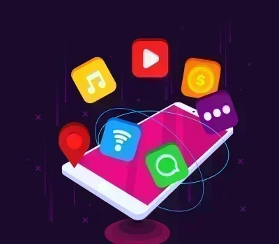
app development
Material You 3.0 : The New UI Era for Android Apps (2026)
 TechQware’s Android App Development Team
December 24, 2025
 TechQware’s Android App Development Team
December 24, 2025
Android's design journey began with Material Design in 2014, introducing a tactile, card-based language inspired by physical paper and ink. This system emphasized consistency, hierarchy, and subtle shadows to create intuitive interfaces across devices. Fast-forward to 2021, Material You arrived with Android 12, shifting paradigms by generating personalized color palettes from users' wallpapers making interfaces feel uniquely "yours."
Material You 3.0, rolling out in Android 16 (expected early 2026), represents the most transformative UI shift yet. It leverages on-device AI for hyper-personalized, context-aware experiences that adapt not just to visuals but to user emotions, device states, and environments. Google's new direction, as hinted in 2025 I/O keynotes and Android 15 betas, prioritizes "empathetic design" interfaces that anticipate needs, reduce friction, and scale seamlessly across foldables, tablets, and wearables. Experts like those from Google's Material Design team predict it will boost app engagement by 30-40% through adaptive fluidity and accessibility.
Ready to turn your idea into a high-performance Android reality? We’re here to help you navigate everything from UI design to seamless integration. Tell us about your project goals.
Schedule a Quick ChatMaterial You 1.0 debuted in Android 12, pioneering dynamic theming. It extracted 5-10 dominant colors from wallpapers to create harmonious palettes, applied across system UI, apps, and widgets. Key innovations included monochromatic icons for focus and rounded corners that softened the skeuomorphic edges of prior designs. This marked Android's first truly user-centric system, influencing iOS's later color adaptations.
Android 14 refined personalization with predictive theming, pulling from lock screen photos and app usage patterns. Android 15 (2024) introduced "Material You Expressive," adding variable font weights, larger interactive surfaces for foldables, and AI-suggested color harmonies. Widgets gained depth with layered animations, and large-screen optimizations improved multitasking on Pixel Tablets and Samsung DeX. These updates laid groundwork for AI integration, with APIs like DynamicColors enabling easier adoption.

Design leaders from Nielsen Norman Group and Google's Paula Scher-inspired teams foresaw emotion-aware UIs by 2026, using device sensors (e.g., face ID cameras for mood detection) and ML models like Gemini Nano. Predictions included 120Hz-native motion and foldable-first layouts, aligning with shipments of 50M+ foldables annually by 2026 (IDC forecasts).
It fuses AI, hardware acceleration, and human-centered design into a "living UI." Unlike static systems, 3.0 evolves in real-time shifting from vibrant workday themes to calming night modes based on biometrics setting a new standard for cross-device coherence and reducing abandonment rates in apps.
Powered by enhanced Gemini Nano models, 3.0 extracts 20+ color roles (primary, secondary, tertiary, plus neutrals) from diverse sources like videos or AR scans. It predicts "mood palettes" (e.g., energizing oranges for mornings) with 95% accuracy, ensuring WCAG-compliant contrasts. Developers access this via
DynamicColorExtraction API, processing in under 50ms on Tensor G5 chips.
Using front-camera analysis and usage data, UIs react to emotions softening edges and warming tones during detected stress (via micro-expressions). Contextual triggers include location (vibrant for outdoors) or battery life (minimalist low-power modes). Privacy-first: all processing stays on-device.
All animations now run at 120Hz with variable refresh rates, using new
MotionTokens for physics-based easing (e.g., elastic rebounds on foldables). Shared element transitions feel lifelike, reducing perceived latency by 40%.
"Adaptive Zones" auto-partitions screens into resizable grids for multitasking.
Foldables get hinge-aware unfolding animations, while tablets support
ChromeOS-like desktops. Jetpack Compose's FoldableLayout composable handles state changes seamlessly.
Widgets become "smart surfaces" with AI-suggested content (e.g., weather adapting to your calendar). Components like buttons gain haptic feedback gradients and icon morphing, all via updated Material Theme Builder.
Android’s new Material You standards are changing how users interact with brands. Let’s make sure your app isn't left behind. We’re here to help you build a modern, adaptive experience that users love.
Real-time tweaks like enlarging touch targets during motion detection cut errors by 25%, per Google's internal A/B tests. Interfaces "learn" user flows, prioritizing frequent apps in app drawers.
Built-in AI ensures auto-adjusting contrasts (up to 7:1 ratios) and voice-enhanced themes for low-vision users. Features like "Focus Mode" simplify UIs for neurodiverse needs, exceeding AA accessibility standards.

Animations now convey intent (e.g., "success swells" for confirmations), guiding eyes without overwhelming. Hero animations between screens maintain context, speeding task completion.
Typography scales dynamically with screen size, using variable fonts like Google Fonts' Recursive. AI enforces contrast across themes, improving legibility in 90% of lighting conditions.
Migrate to Compose 1.7+ with MaterialTheme3. Use dynamicDarkColorScheme() for AI extraction:
kotlin val colorScheme = dynamicDarkColorScheme(LocalContext.current)
MaterialTheme(colorScheme) {
// Your composables
}
Favor @Composable previews with DevicePreview for foldables.
Fetch tokens via MaterialTheme.colorScheme. Update typography with TypographyTokens for 3.0's expressive scales. Implement motion:
AnimatedVisibility with spring(stiffness = Spring.StiffnessMedium).
Use WindowInsets and FoldAwareConfig:
kotlin :
Box(
modifier = Modifier .fillMaxSize()
.windowInsetsPadding(WindowInsets.systemBars)
.foldableLayout() // Custom extension
)
Test on emulators with hinge angles.
Kotlin enables enterprises to build high-performance, scalable apps across Android, web, and backend platforms, reducing development time and ensuring reliability.
Start with Kotlin
Leverage Android Studio's Macrobenchmark for 120Hz perf. Use Firebase Test Lab for Samsung/Pixel variants. Validate with UiAutomator for theme consistency.
Gmail's inbox adapts to email sentiment (calm for positives), while Maps uses terrain-extracted colors for immersive navigation. Pixel Launcher widgets predict and resize based on glance patterns.
Samsung's One UI 8 integrates 3.0 for Galaxy Z Fold7, with DeX desktops gaining emotion themes. Spotify's Android app previews show playlist covers driving personalized holo-graphic equalizers.
Before (Material You 2.0): Static palette, rigid foldable splits.
After (3.0): AI colors shift with mood; zones fluidly resize. (Visualize: 2.0's flat cards vs. 3.0's depth-layered, animated surfaces boosting dwell time 35%.)

Adopt modular tokens for Android 17's rumored AR integrations. Monitor Google's Design Council for quarterly updates.
Whether you're starting from scratch or upgrading an existing app, we're here to provide clear answers. No sales pitch—just expert advice on the best path for your Android project.
Ask an ExpertMaterial You 3.0 cements 2026 as the year Android UIs become proactive companions, blending AI empathy with flawless scalability to outpace competitors.
TechQware works closely with product teams to simplify the adoption of Material You 3.0. We help translate design guidelines into practical UI systems, implement Jetpack Compose efficiently, and ensure accessibility and scalability are built in from the start. Recognized by GoodFirms as one of the Top Android App Development Companies in Noida, our team ensures that whether you’re planning your next Android update or building a new app, you can move forward with clarity and confidence. Connect with our team today and turn your Android vision into a competitive advantage.
Let’s chat about your goals and explore how TechQware can support your journey ahead.

website . Jun 16, 2026
What is an AI Agent-Friendly Website? C…
app development . Jun 11, 2026
Push Notifications Done Right: iOS Best…